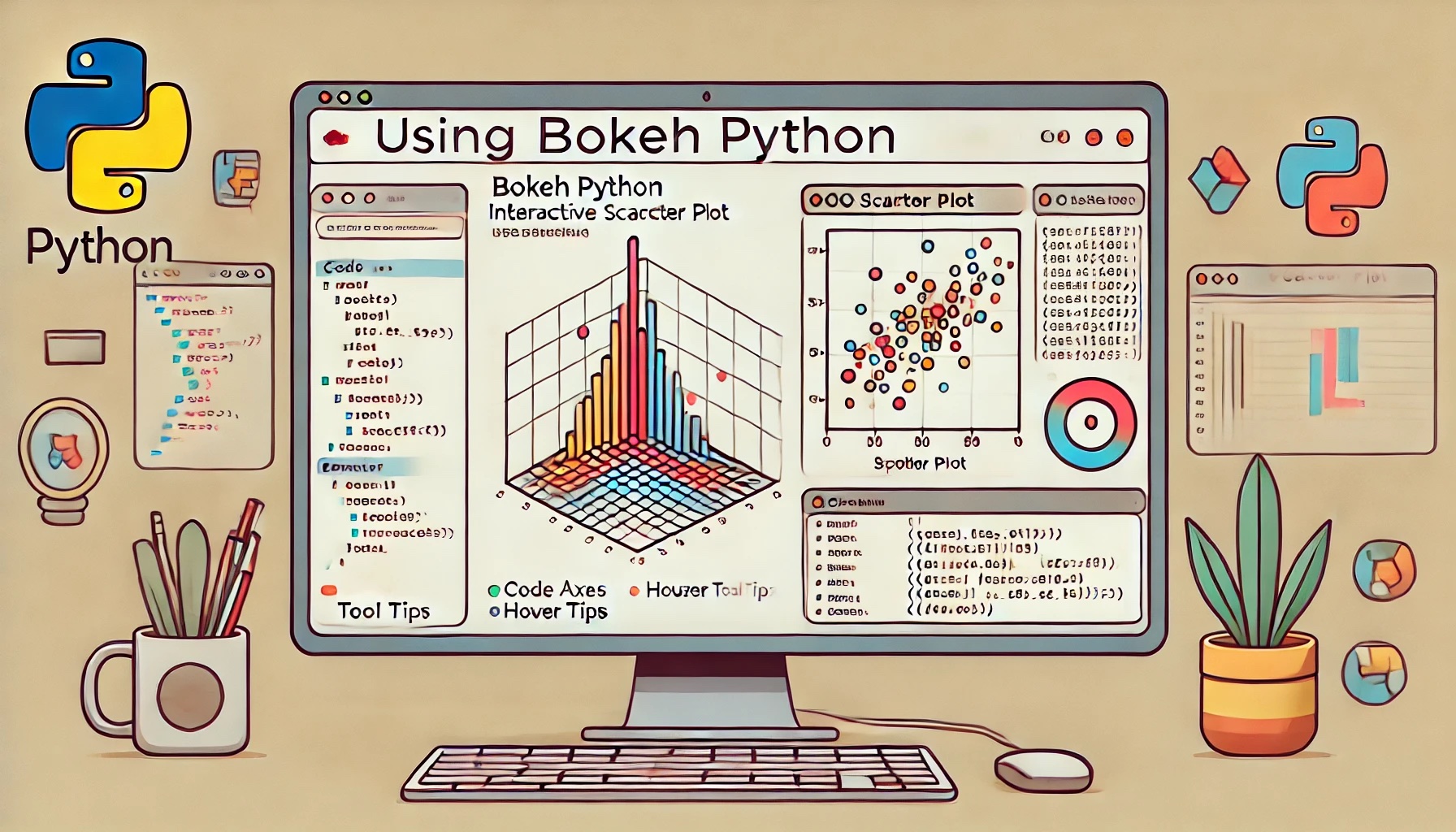
Interactive Data Visualization with Bokeh Python A Complete Beginners Guide
Bokeh is a powerful Python library for creating interactive visualizations that can be rendered in web browsers. This guide will walk you through the basics of Bokeh, from installation to creating simple interactive plots. By the end of this tutorial, you will have a good understanding of how to use Bokeh for your data visualization needs.
1. Installing Bokeh
To start using Bokeh, you need to install it. Use the following command:
pip install bokeh
You can also verify the installation by running:
import bokeh
print(bokeh.__version__)
2. Setting Up Your First Bokeh Plot
Step 1: Import Required Libraries
Bokeh’s primary interface for creating visualizations is through the bokeh.plotting module. Import the necessary components:
from bokeh.plotting import figure, show
Step 2: Create Data
Define the data you want to visualize. For example:
x = [1, 2, 3, 4, 5]
y = [6, 7, 2, 4, 5]
Step 3: Create a Figure Object
Create a figure object to define the structure of your plot:
p = figure(title="Basic Scatter Plot", x_axis_label='X Values', y_axis_label='Y Values')
Step 4: Add a Plot
Use methods like circle, line, or square to add plots to your figure. Here, we add a scatter plot:
p.circle(x, y, size=10, color="blue", alpha=0.5)
Step 5: Display the Plot
Use the show() function to render your plot in a web browser:
show(p)
When you run this code, a browser window will open displaying your scatter plot.
3. Customizing Your Plot
Adding Interactivity
Bokeh automatically includes tools like zoom and pan. You can customize these tools:
p = figure(title="Interactive Plot", tools="pan,box_zoom,reset,save", x_axis_label='X', y_axis_label='Y')
p.circle(x, y, size=10, color="green", alpha=0.8)
show(p)
Changing Plot Appearance
Modify the grid:
p.xgrid.grid_line_color = None
p.ygrid.grid_line_dash = [6, 4]
Customize the title:
p.title.text_font_size = "18pt"
p.title.align = "center"
4. Adding Hover Tooltips
Hover tools provide additional interactivity by displaying information when you hover over points.
Step 1: Import the HoverTool
from bokeh.models import HoverTool
Step 2: Add HoverTool to the Figure
hover = HoverTool()
hover.tooltips = [
("Index", "$index"),
("(X, Y)", "($x, $y)")
]
p.add_tools(hover)
Step 3: Display the Plot
show(p)
When you hover over the points, you will see the corresponding information.
5. Exporting Your Visualization
Save as HTML
You can save your plot as an HTML file for sharing:
from bokeh.plotting import output_file
output_file("scatter_plot.html")
show(p)
Save as PNG
To save your plot as a PNG, you need to install Selenium or pillow:
pip install selenium pillow
Then, use:
from bokeh.io.export import export_png
export_png(p, filename="scatter_plot.png")
6. Creating Layouts and Dashboards
Bokeh allows you to combine multiple plots into a single layout.
Grid Layout
from bokeh.layouts import gridplot
# Create additional plots
p2 = figure(title="Line Plot")
p2.line(x, y, line_width=2, color="red")
# Combine into a grid
layout = gridplot([[p, p2]])
show(layout)
Adding Widgets
You can add sliders, dropdowns, and other widgets for interactivity.
from bokeh.models import Slider
from bokeh.layouts import column
slider = Slider(start=0, end=10, value=1, step=0.1, title="Slider Example")
layout = column(p, slider)
show(layout)
7. Best Practices
- Use meaningful titles, axis labels, and tooltips to make your visualizations clear.
- Experiment with colors and sizes to make plots visually appealing.
- Use layouts and widgets to enhance user interaction.
Congratulations! You have successfully created your first interactive visualizations with Bokeh. Explore its extensive documentation and experiment with different features to master the library. Hope this is helpful, and I apologize if there are any inaccuracies in the information provided.


Comments
Post a Comment